Matrix Maker App

Stack
- React Native
- Expo
- TypeScript
I studied music in community college, where I learned about writing atonal music using a 12-tone matrix. Building a 12-tone matrix is a tedious process that requires 134 tiny math problems to fill out a 12x12 grid. It’s the perfect kind of problem for a computer to solve, so it seemed like an ideal application to build when I wanted to learn mobile development.
UI Challenges
I explored several websites and apps for building 12-tone matrices and found most of them difficult to use. On some of them, deleting notes was tedious. On others, it was hard to tell what row you were looking at. And nearly all of the applications I tried required large screens to work well.
My challenge was building an easy-to-use app that could fit most of the features a user would need on a single tiny mobile screen.
Leveraging Expo
I built the project with React Native using Expo so that I could leverage my skills with React Web and let Expo manage the parts I was less familiar with (like compiling React Native applications).
The Completed App
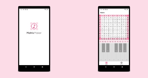
The app’s matrix screen accepts user input via an on-screen piano and displays the generated matrix. When a user taps a key, it is added to the matrix. If the user taps a key that is already on the Matrix, it is removed and the notes after it move up to fill its space.

The app’s matrix screen
As I used the app, I found deleting all of the notes to reset the matrix was tedious, so I added a hidden menu that slides down when you tap the matrix and reveals a “Clear Matrix” button.

Tapping the matrix will reveal a hidden menu that allows you to clear all notes
The settings screen contains only one setting: a toggle that switches the notes between sharps, flats and note numbers. When I originally started building the app I had this setting on the matrix screen, but I found it took away too much space from the matrix itself on small devices.

The app’s settings screen
I knew I needed help designing an app icon, so I worked with a designer on Fiverr. I’m incredibly happy with the result.

The app icon
I did not actively maintain the app, so it is no longer an the Google Play Store. However, I built a web version using vanilla JS version that you can view at 12tone.app.